

onestar Co., Ltd.,
Project Management / Design / Construction
WORK PLACE
2540㎡
Showcasing a sophisticated corporate identity through the pursuit of efficiency and practicality
With the office relocation and expansion of onestar Co., Ltd., we worked on the development of the client’s new office. By designing efficient and practical office spaces that would eliminate unnecessary elements, we tried to develop office spaces that would showcase the client’s corporate identity more clearly while optimizing work styles and promoting communication.
CONCEPT
Since we wanted to develop office spaces that would bring about greater efficiency and practicality while strengthening the client’s corporate identity, the theme we came up for this project was “rub up.” By incorporating a new approach into the client’s characteristics in terms of different aspects, such as work style improvement, design, and office management, we proposed an office environment that would accommodate the needs of the times. Furthermore, to create new places for communication and to help employees carry out their work smoothly, we set up a symbolic area on each of the two floors for encouraging communication.
PLANNING
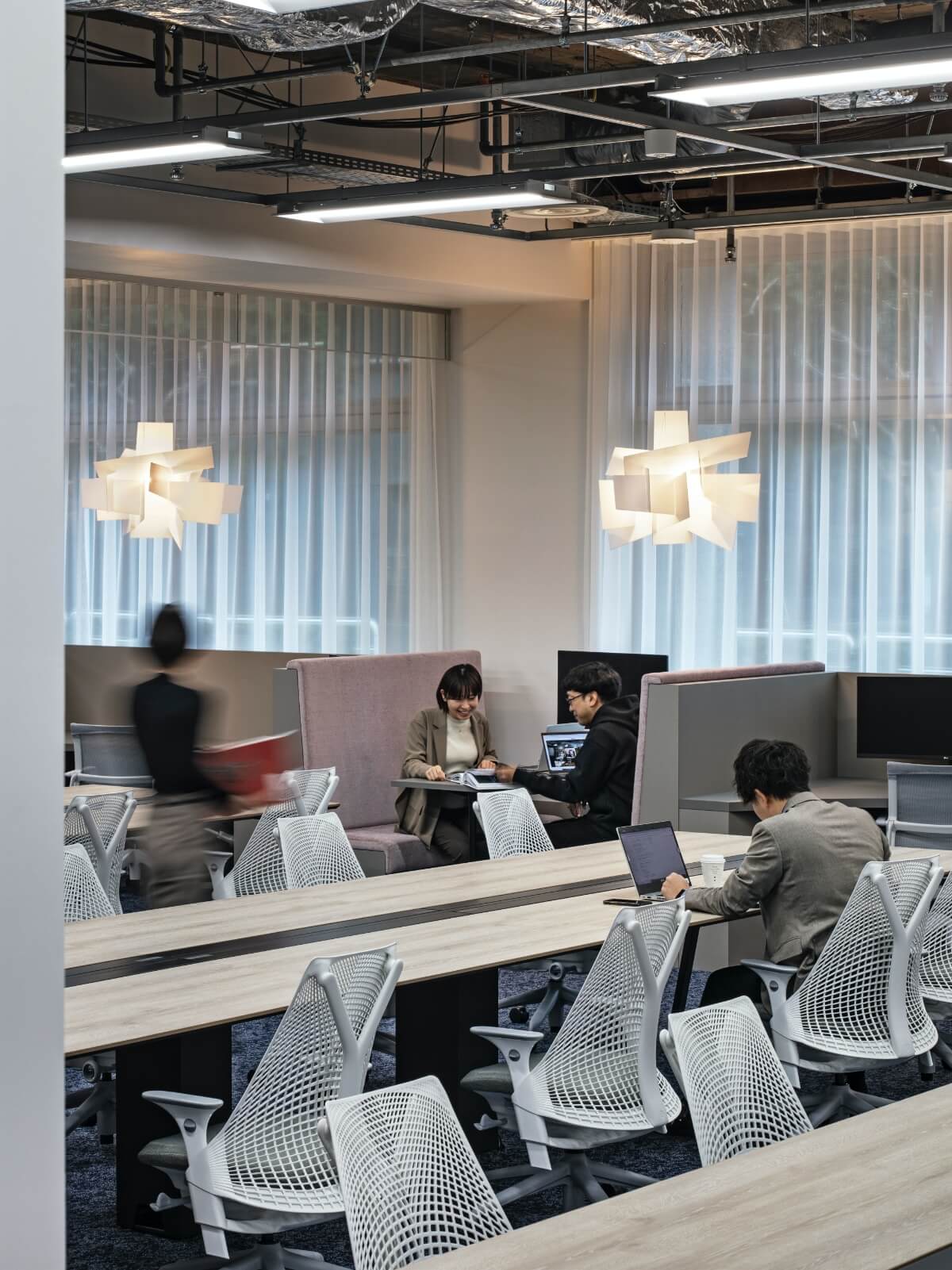
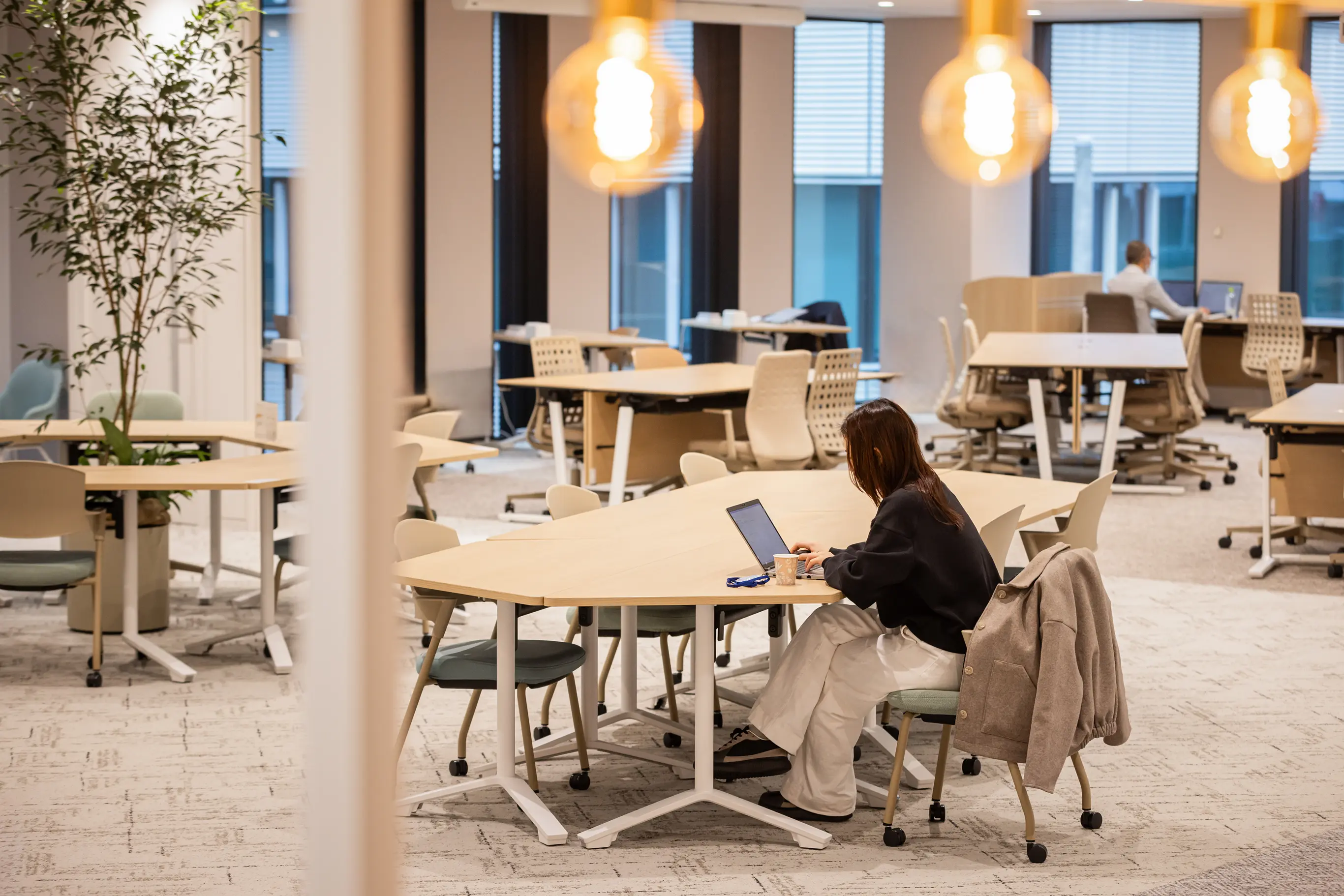
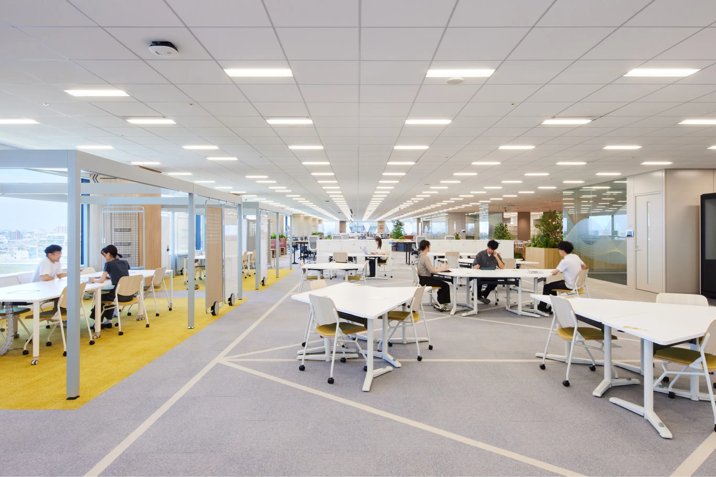
We considered pathways and equipment arrangement meticulously for office optimization focused on efficiency and practicality. Since the company uses two floors, the 3rd and the 5th floors, of the building, we laid out the space on the 3rd floor in such a way as to accommodate various purposes such as visitor reception, internal and external branding efforts, and the pathways around the office. For the 5th floor on the other hand, we set up a symmetrical office space, making use of the rectangular shape of the building structure, and developed a layout that would make it easy for the employees to get around. Not only does the layout ensures the same work environment in any seat, but it also enables the employees to access different office features smoothly.
DESIGN
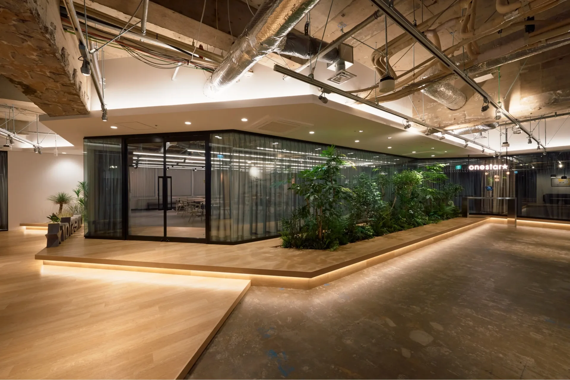
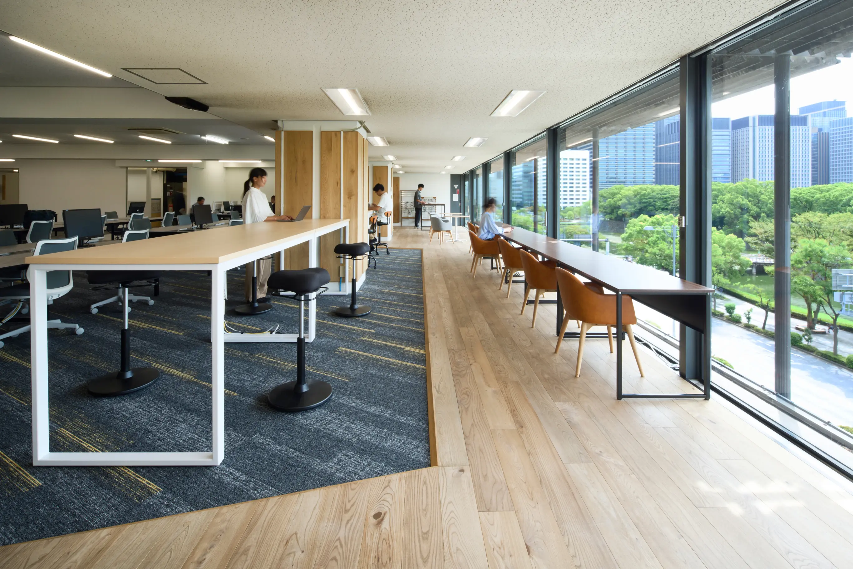
By using the minimum variety of colors and neutral color tones and by effectively combining natural materials and glass walls while maintaining the minimal and rustic look of the old office spaces, we updated them into neutral yet sophisticated spaces that would accommodate the diversity of the employees. In the entrance area on the 3rd floor, the glass walls create a sense of depth. For the pathway leading to the meeting rooms, we incorporated indirect lighting and plants, and purposefully created differences in floor and ceiling heights to provide a visual experience and create a highlight that would never look dull.
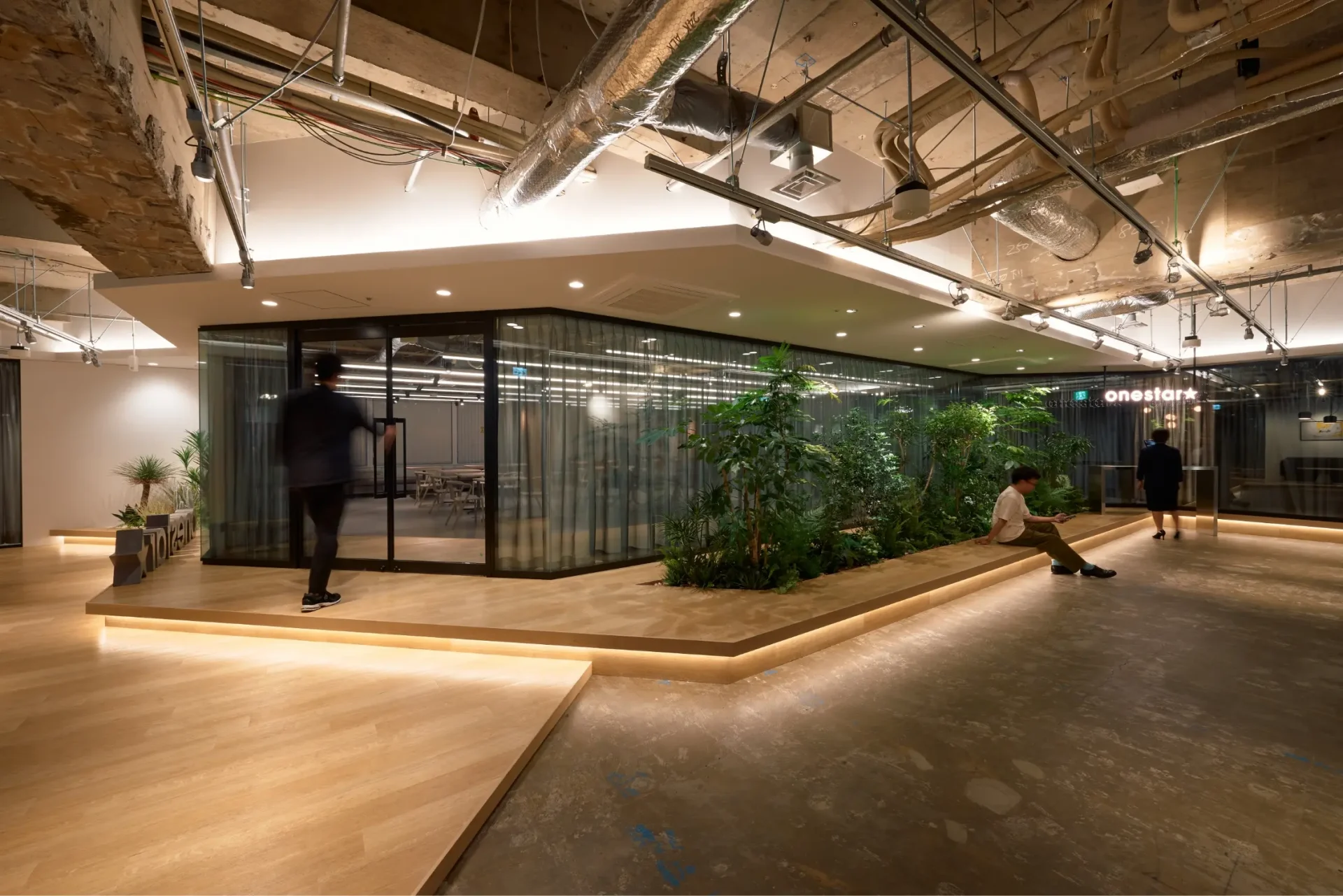
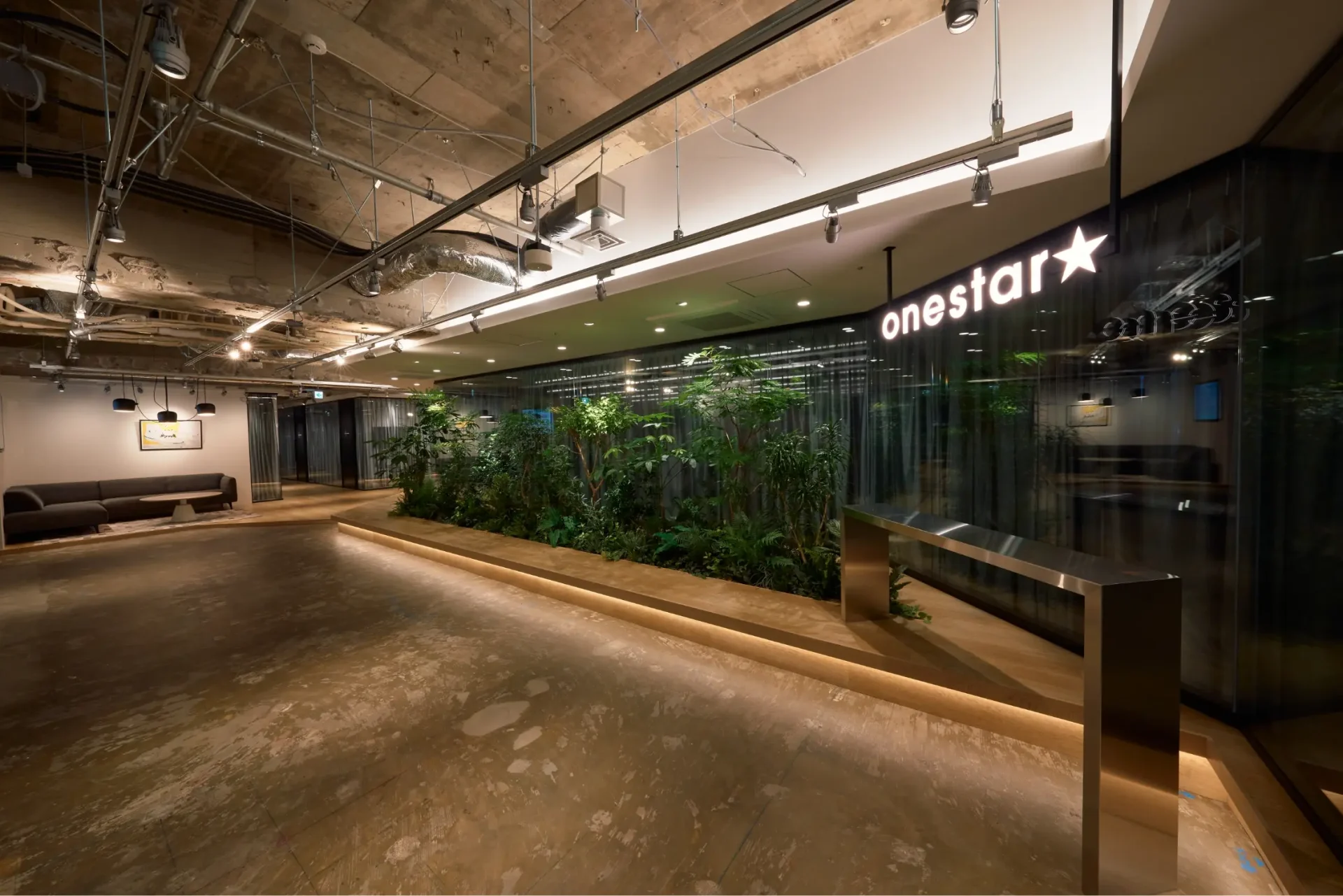
This is the entrance area on the 3rd floor. While making use of the rustic feel of the building, we created a sense of depth and neutrality by incorporating glass walls and translucent curtains.
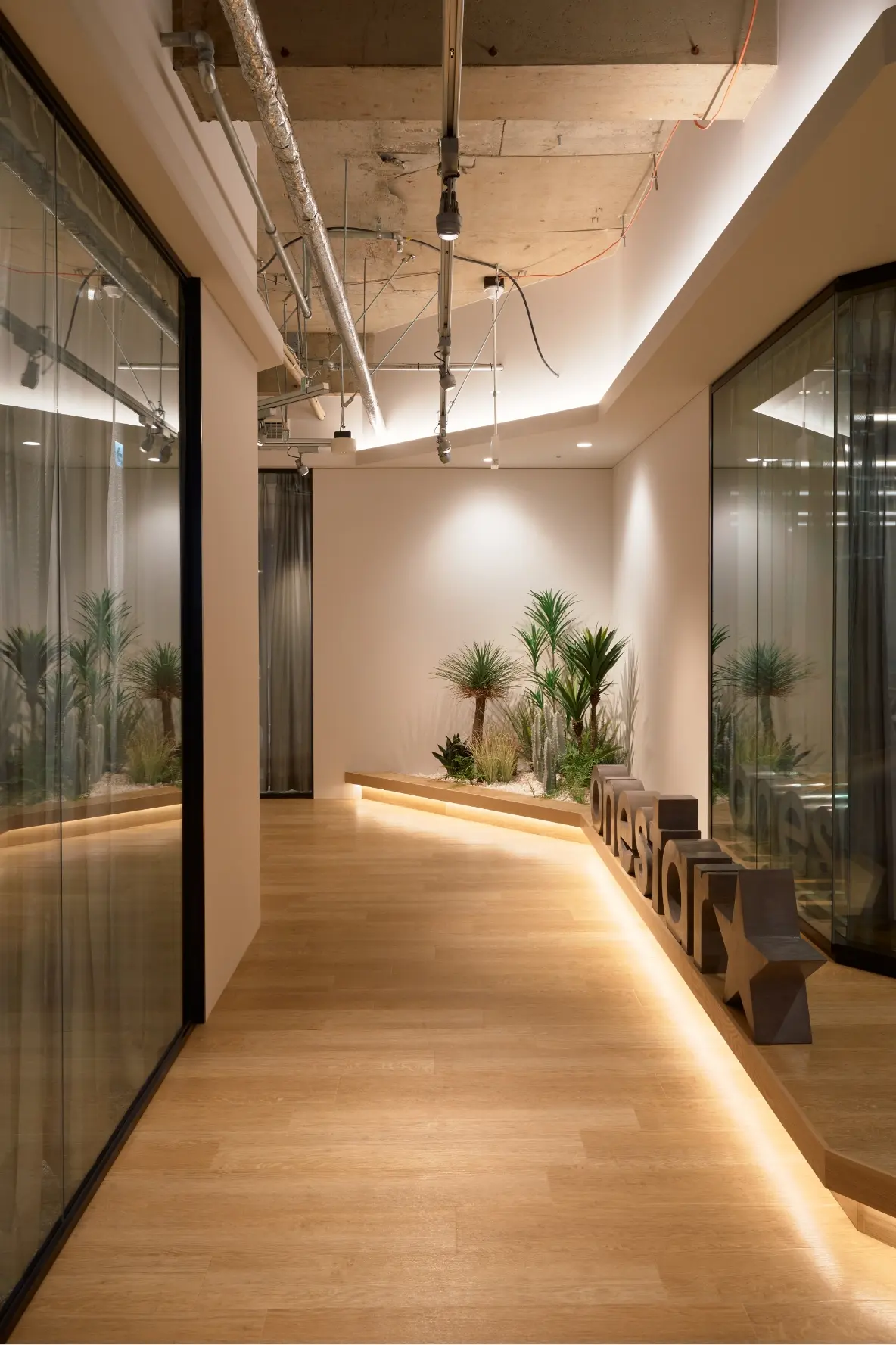
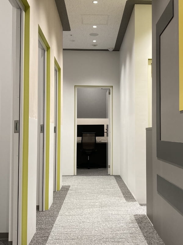
For the pathway leading to the area where there are meeting rooms, a seminar/free space, a pantry, a photo studio , and other special features, we incorporated indirect lighting and plants and created differences in the floor and ceiling heights to give it a fresh look.
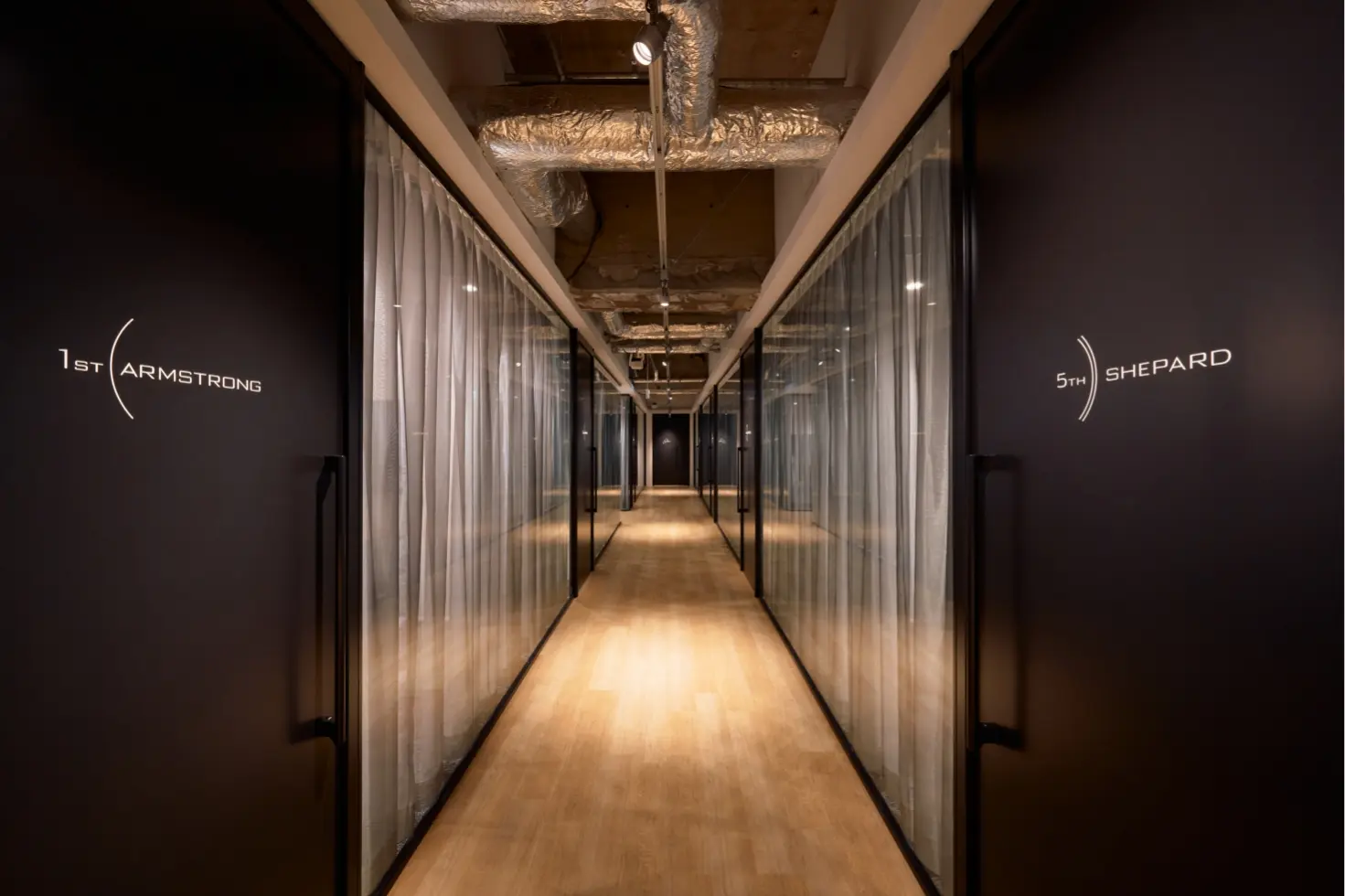
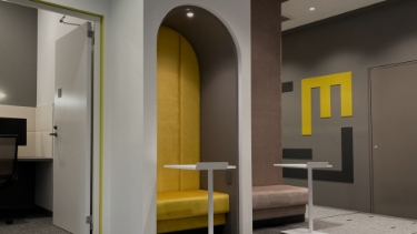
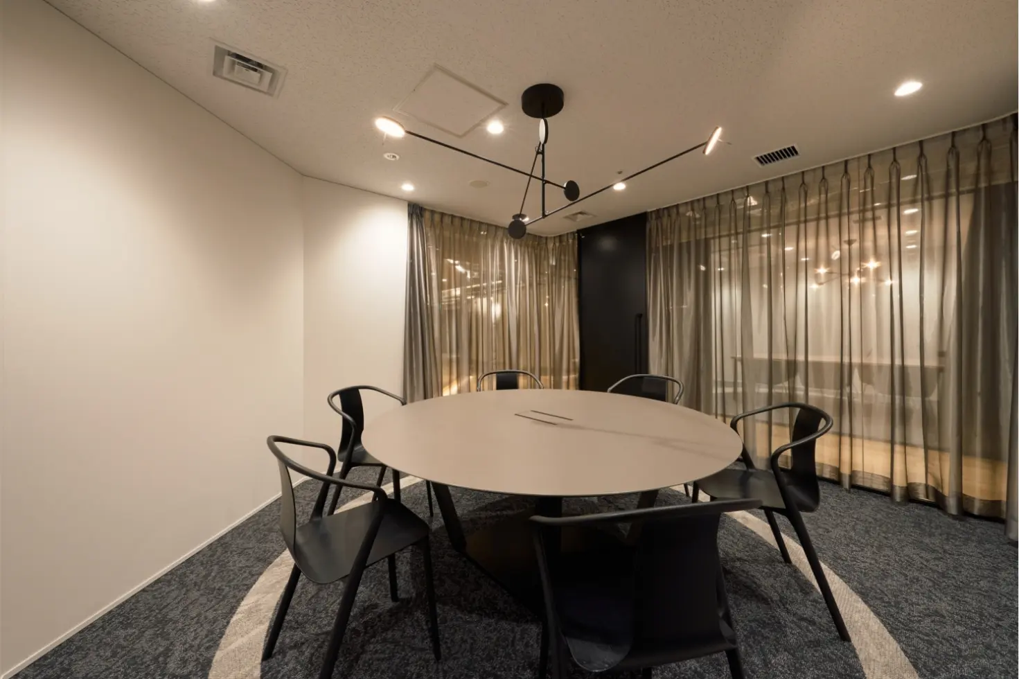
Based on the concept “moon landing” inspired by one of the client’s values from their corporate philosophy, “frontier spirit,” the twelve meeting rooms were given names of twelve astronauts who put their feet on the moon. Moreover, each meeting room features a different design and a name sign to reflect the concept in the designs of the rooms.
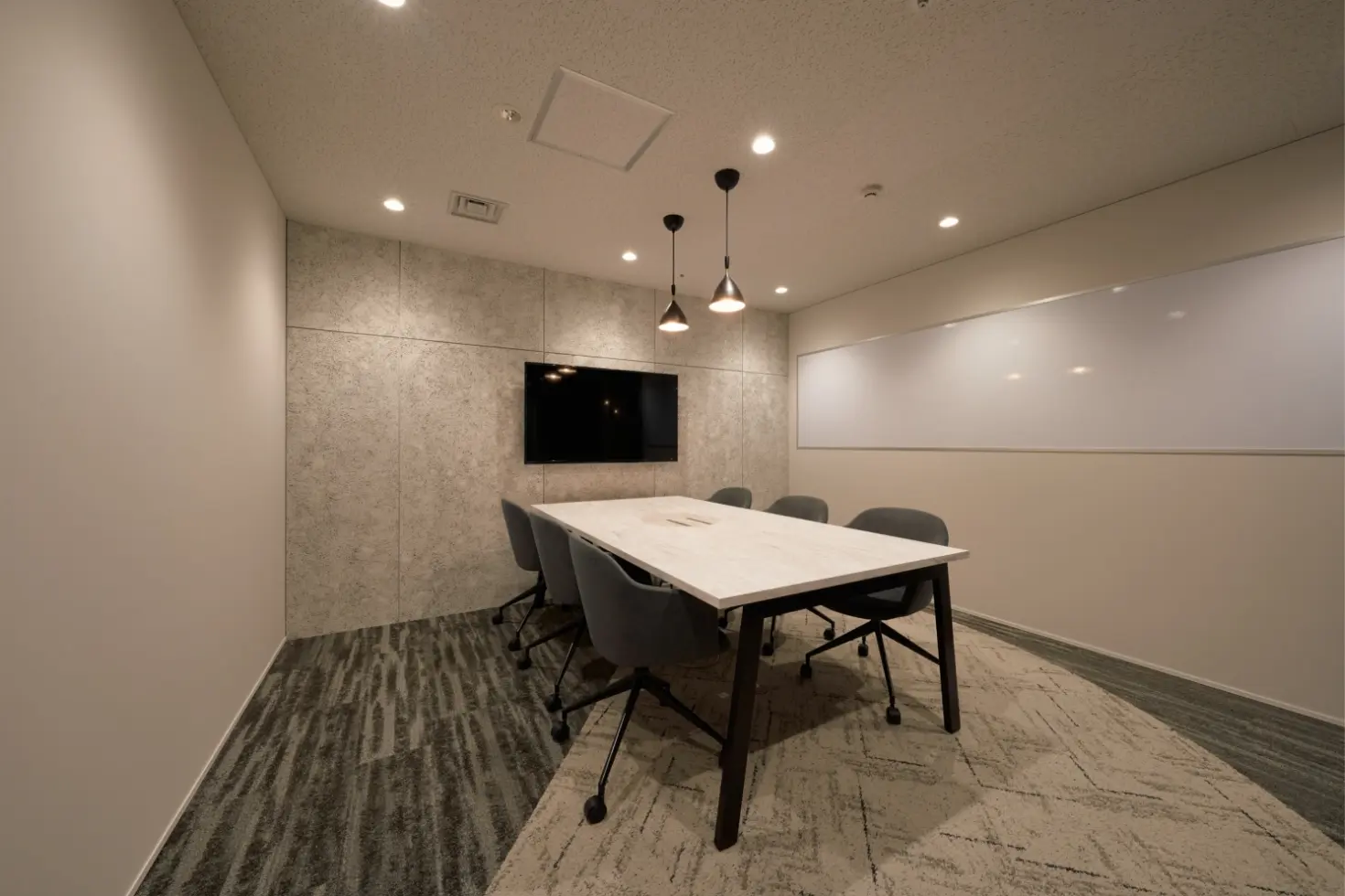
The moon-inspired floor design of a meeting room also serves as a nice topic for starting a conversation with a guest.
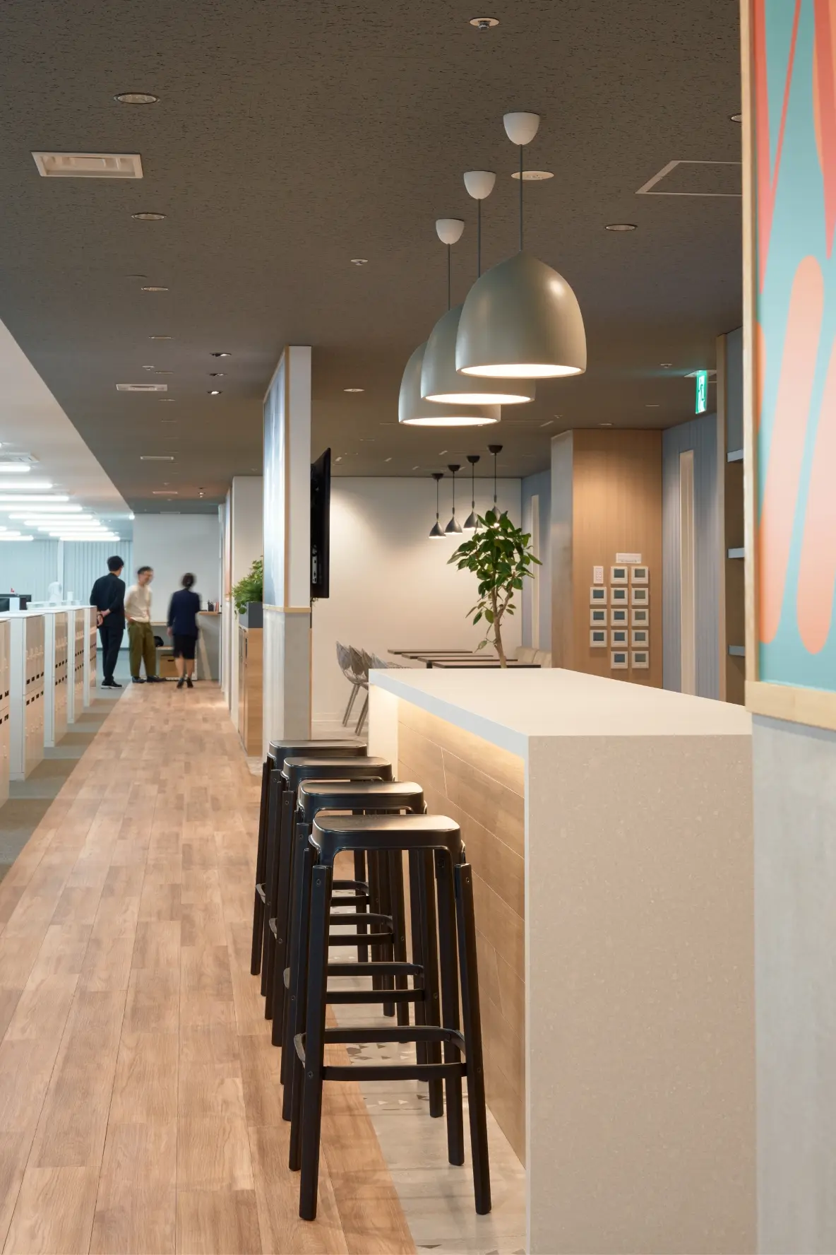
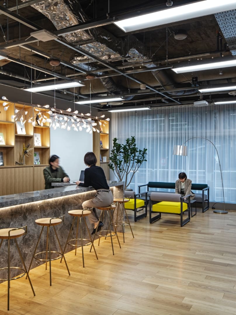
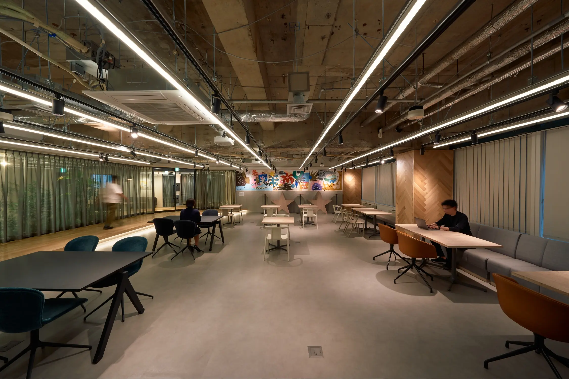
The area around the pantry in the center of the main work area on the 5th floor has been specially painted to make it stand out with a unique design.
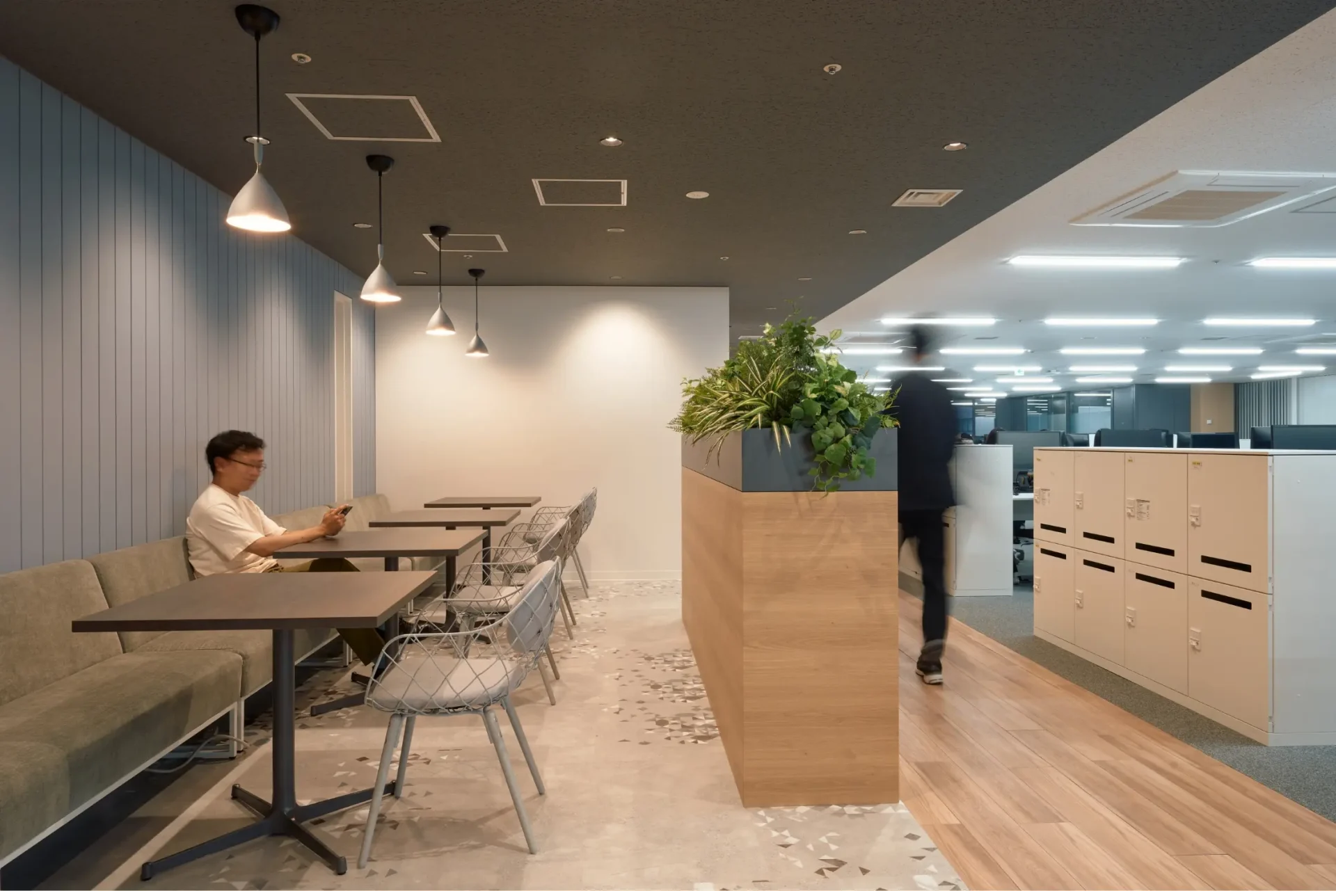
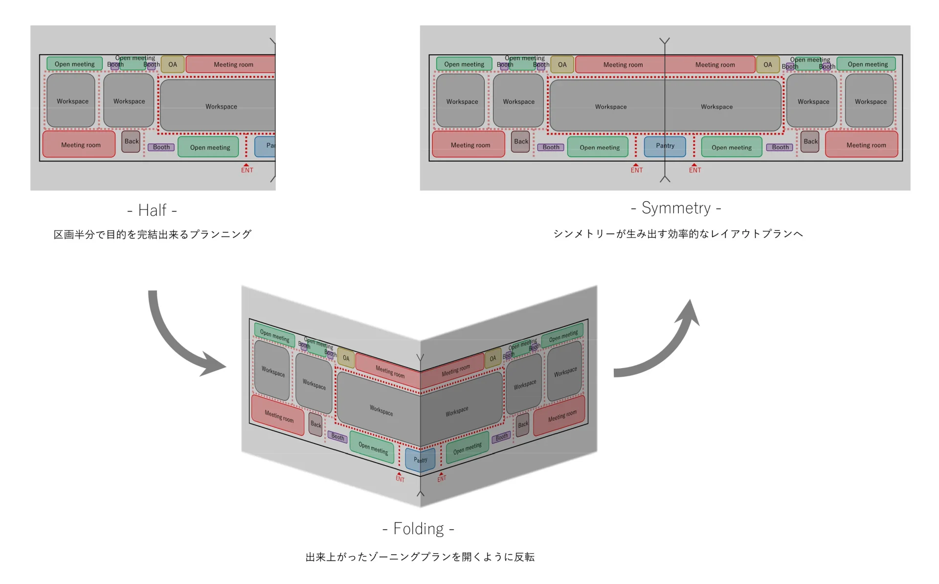
By developing a layout that puts all the necessary features in half of the space, we created clear and efficient pathways to improve movement efficiency. Also, the symmetrical floor plan enables the client to keep track of the features of different areas without a hassle when changing the seating arrangements.
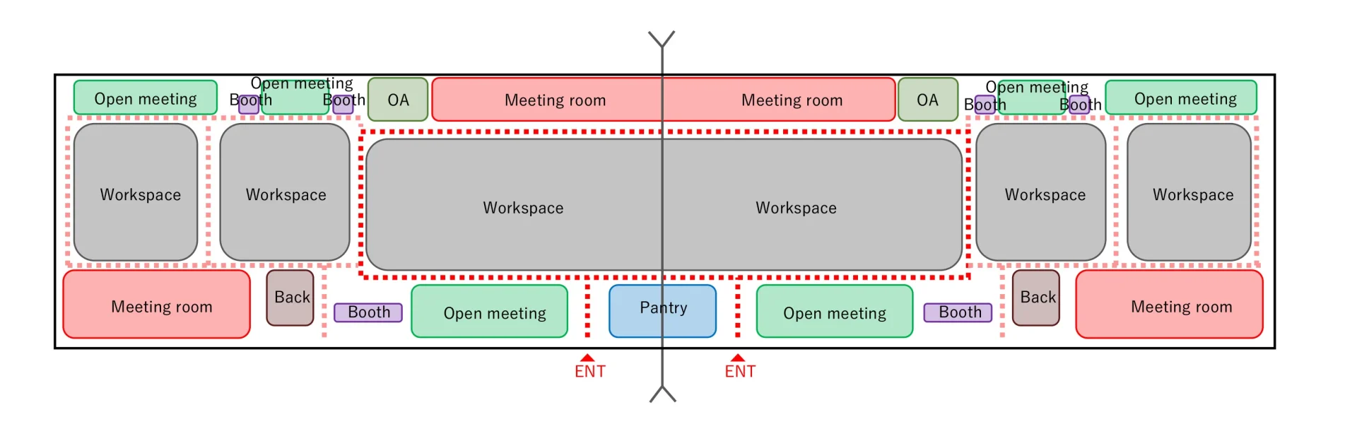
The pantry in the center of the main work area functions as an important connector driving communication between the workspaces that stretch on both sides. The pantry has been set up adjacent to the entrances to the workspaces on both sides, where everyone walks by, to serve as a hub for maximizing opportunities for communication.
LAUNCH
Closely working with the client and taking a satisfaction-focused approach, we succeeded in smoothy carrying out the project. We received great feedback from the client as we succeeded not only in providing a workplace environment tailored to the client’s corporate culture, but also in developing a plan considering the client’s vision for the future, and in maximizing the investment cost effectiveness by getting rid of unnecessary features.
PROJECT FLOW
-
Clarification of requirements
We were expected to develop a plan that would help the client deepen their corporate identity and utilize the office more efficiently and practically. So we analyzed their work styles and necessary office features, then considered what would be the optimal approach for everything from design to office management.
-
Basic plan
We developed spatial designs while sharing and aligning thoughts with the client by comparing the distinctive rectangular shape of the building structure to train cars because we are familiar with their sizes. We gave shape to the client’s request by considering optimal utilization of equipment, adjusting details so as to give variety to the looks of the space, and repeatedly conducting detailed simulations to make sure that every seat has the same level of convenience.
-
Implementation design
While making use of the minimal and rustic design of the old office spaces and keeping the variety of materials to a minimum, we carefully developed the plan, including the selection of materials and designing of details, by emphasizing key elements and visual impression of the spaces where people walk through. By doing so, we gave the entire space a sense of depth and an emotional design while maintaining a simple and orderly look.
-
Cost adjustment
From the proposal phase, we put effort into having the client understand our ideas regarding the building equipment by using equipment drawings and set a policy to allocate budget to designs that would increase the value of the office while ensuring a highly cost-effective equipment plan. We not only selected furniture according to the use, design, and functional priority of each area, but also achieved effective cost management by fully utilizing the existing lighting.
-
Work environment development
We carried out and completed the project smoothly by considering designs and construction methods carefully while communicating closely with relevant companies, including construction companies, and by implementing efficient schedule management and on-site work management.
PROJECT DATA
Client: onestar Co., Ltd.,
Project: New office relocation project of onestar Co., Ltd.,
Business: Work Place Construction
Role: Project Management / Design / Construction
Size: 2540㎡
Location: Minato-ku, Tokyo
Category: Digital direct marketing assistance business
CREDIT
- Project Management
Frontier Consulting Co., Ltd.
- Design
Frontier Consulting Co., Ltd.
- Construction
Frontier Consulting Co., Ltd.
- Photograph
Teppei Hori
BACK TO ALL
CONTACT
If this project got you interested, please do not hesitate to contact us.
Our specialized staff will be glad to answer any of your questions.
WORK PLACE
4,240㎡
Toray International, Inc.
A workplace created with client’s cooperation, reflecting each department’s individuality through a phased renovation
WORK PLACE
2,550㎡
Kurita Water Industries Ltd.
An ABW-oriented office for diverse working styles and for increased communication and sense of belonging
WORK PLACE
4F 4,665.08㎡ + 3F 2723.37㎡ / Total 7388.45㎡
The Mainichi Newspapers Co., Ltd.
Embracing corporate and architectural history—a new chapter for growth and efficiency attained through spatial restructuring
WORK PLACE
1,664㎡
ExaWizards Inc.
Fostering a sense of employee unity and connection for helping experience the core values
WORK PLACE
16,665㎡
DOCON CO.,LTD. Head Office Building
A workplace which pursues creative work styles by leveraging individual and departmental uniqueness