

graniph inc.
Project Management / Design
WORK PLACE
661㎡
A workspace that fosters creativity and professionalism
We led the development of a workspace for our client, graniph, which has entered a new phase under its new brand identity of a “Graphic Life Store.” We designed the new workspace in such a way that it would not only be a place for creating new value through the pursuit of the power of graphics, but also a place in which employees can hone their mindset and go about their work with an even greater sense of pride in their company.
CONCEPT
Inspired by our client’s vision and by their business through which they propose diverse life stories through graphics, the concept we came up for this project was a “Creative Studio” in order to develop a place for creation with freedom and creativity where experts gather.
PLANING
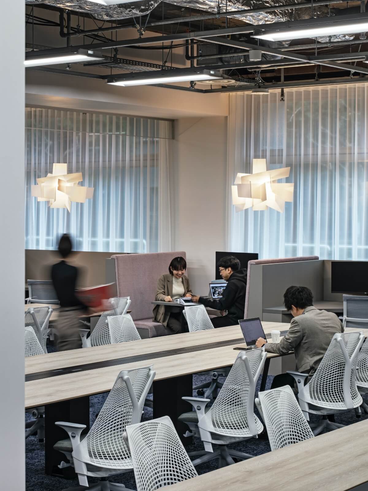
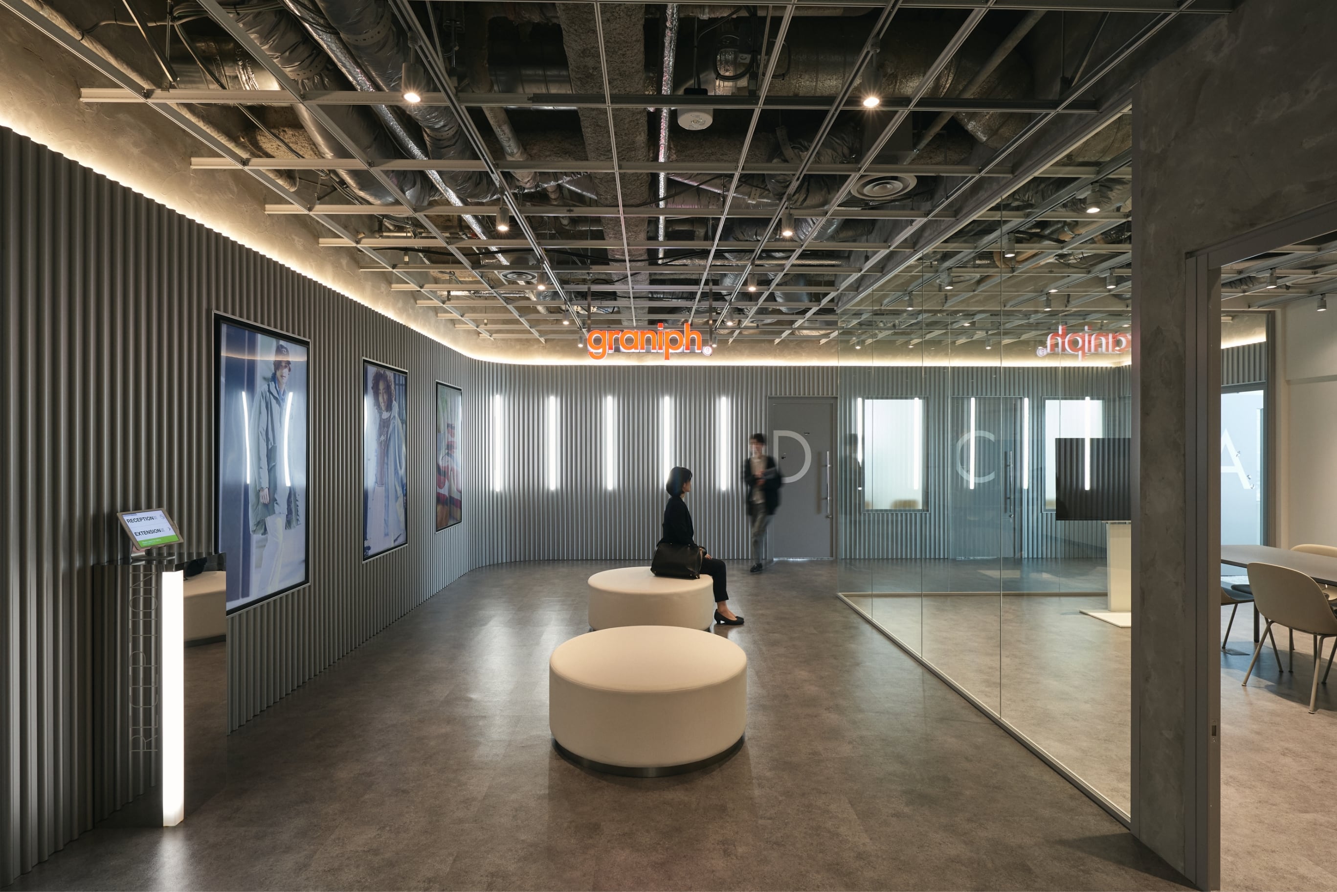
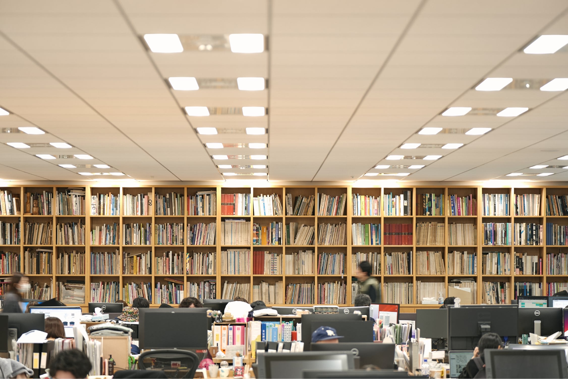
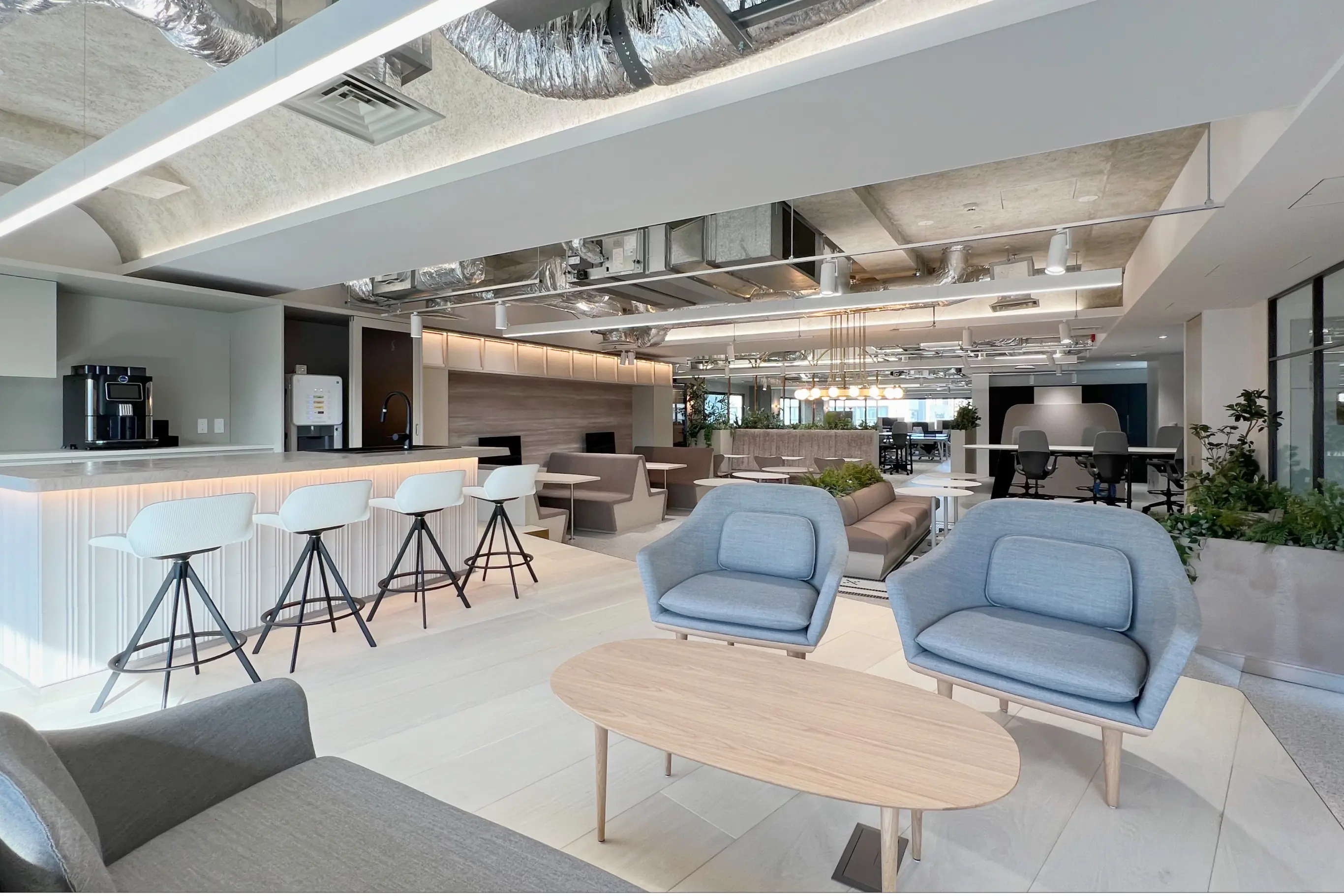
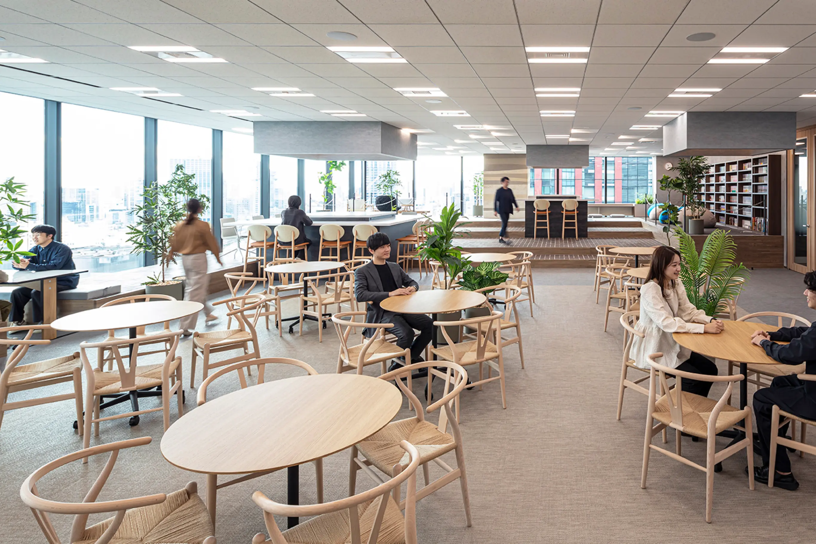
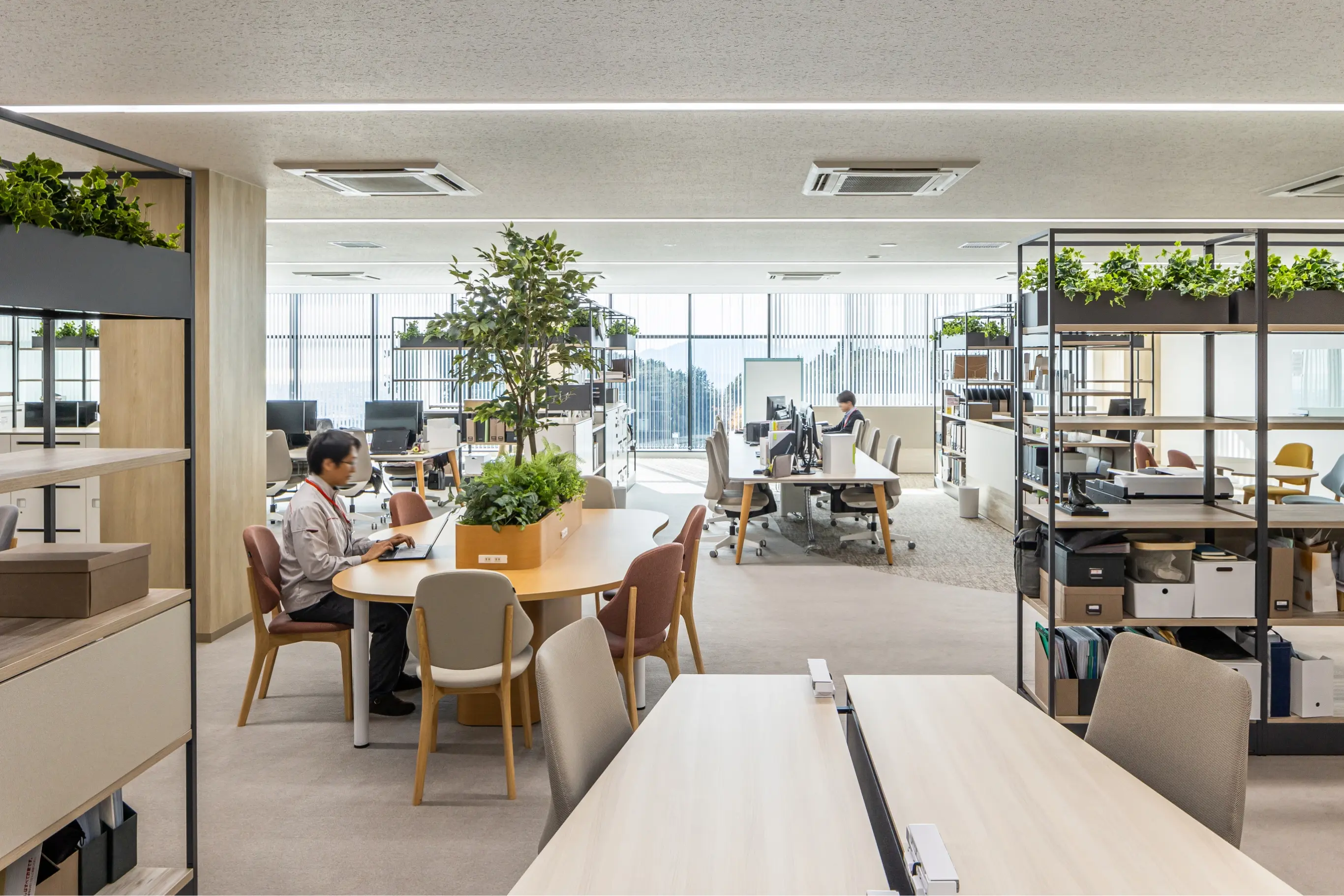
In terms of zoning, we planned the space to ensure comfort and efficiency by arranging each area according to its functional characteristics, such as meeting rooms, a refreshment space, and a sample room and by ensuring that the paths of visitors, employees, and carry-in/out do not overlap. The entrance space enclosing the gallery creates a sense of depth with the reflection of light and shade, inviting those who step in there into the world of the “Creative Studio” with a sense of trust and anticipation. For the main work area, we tried to eliminate distractions in order to develop an environment that enables employees to concentrate on their creative work.
DESIGN
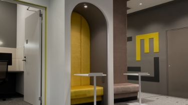
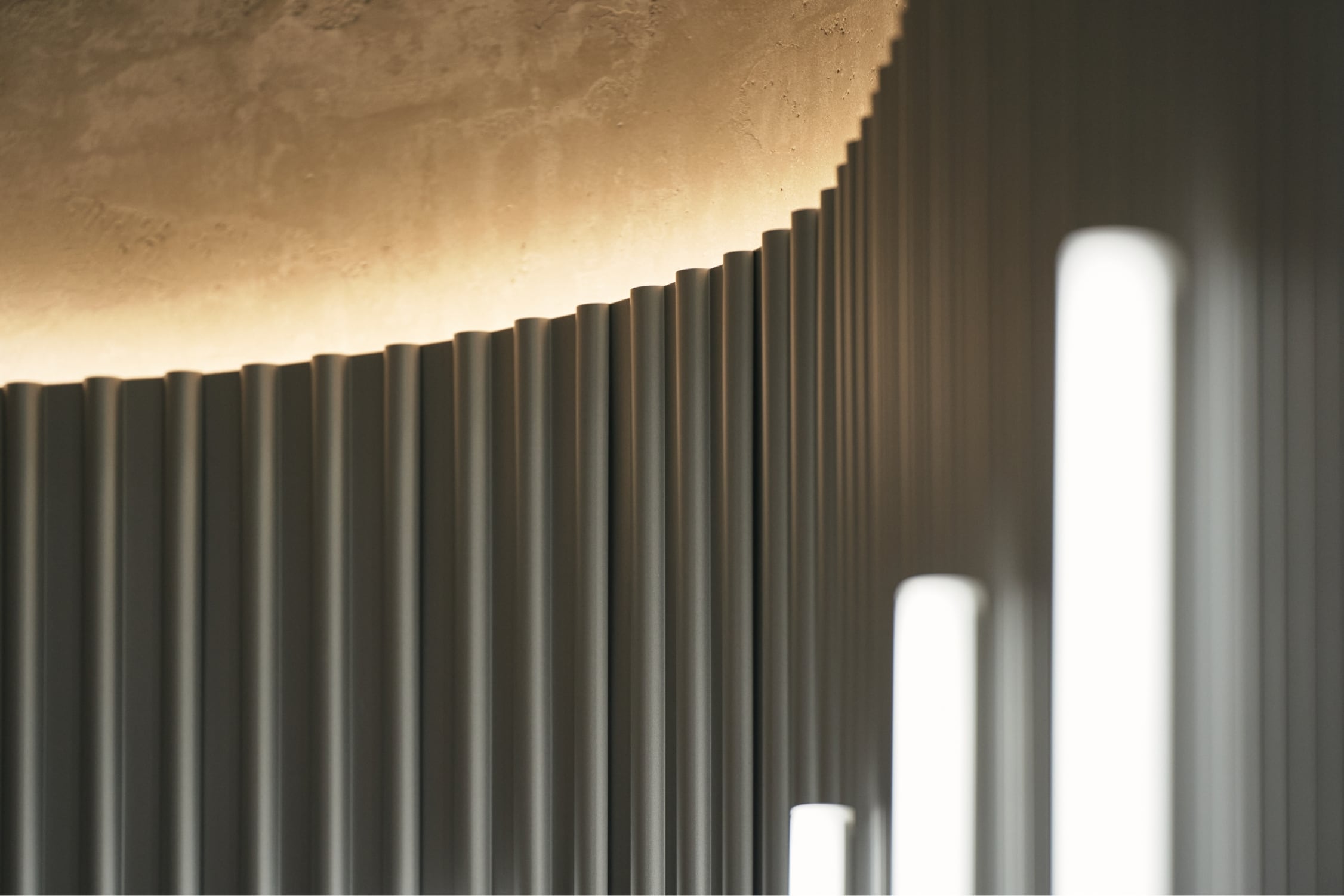
For the entrance space, we designed an inorganic space using silver and gray as the primary colors, then expressed the concept of “beauty of continuity” by installing displays, windows, and lights in the space while following a certain pattern in terms of size and layout. For the gallery space, we saw it as a stage for presenting the core of the company, so we expressed different material textures and color tones by using different illuminance levels to naturally direct the attention of visitors. For the main work area, we mainly used wood to create a sense of comfort, but we also incorporated materials used for the entrance space to ensure a consistent overall look.

The entrance features an eye-catching logo sign with colors that stand out in the inorganic space decorated with spandrels.
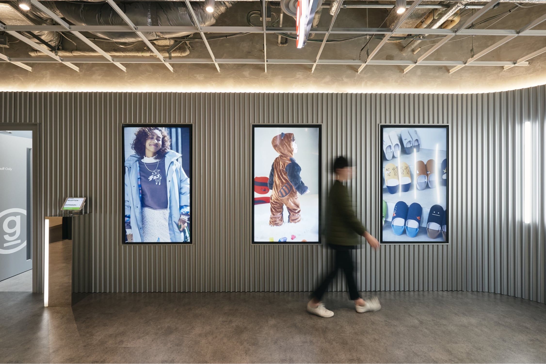
The displays, the first thing visitors see when they enter, show information including seasonal content and events.
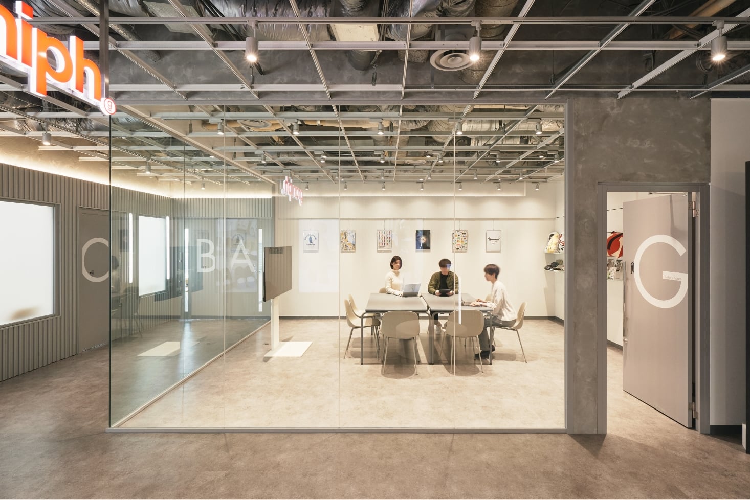
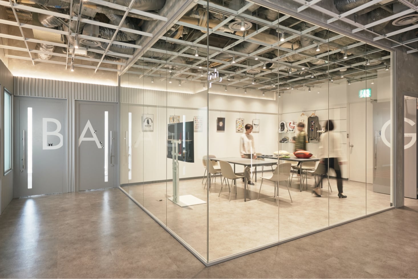
The glass partitions of the gallery space create rich layers throughout the space. We also designed the space in such a way that the reflection of indirect lighting in the partitions would reinforce the idea of “beauty of continuity.”
While using the same floor materials for both the entrance and gallery spaces, we used different illuminance levels of the spotlights so that these materials would appear as though they are different materials with different color tones.
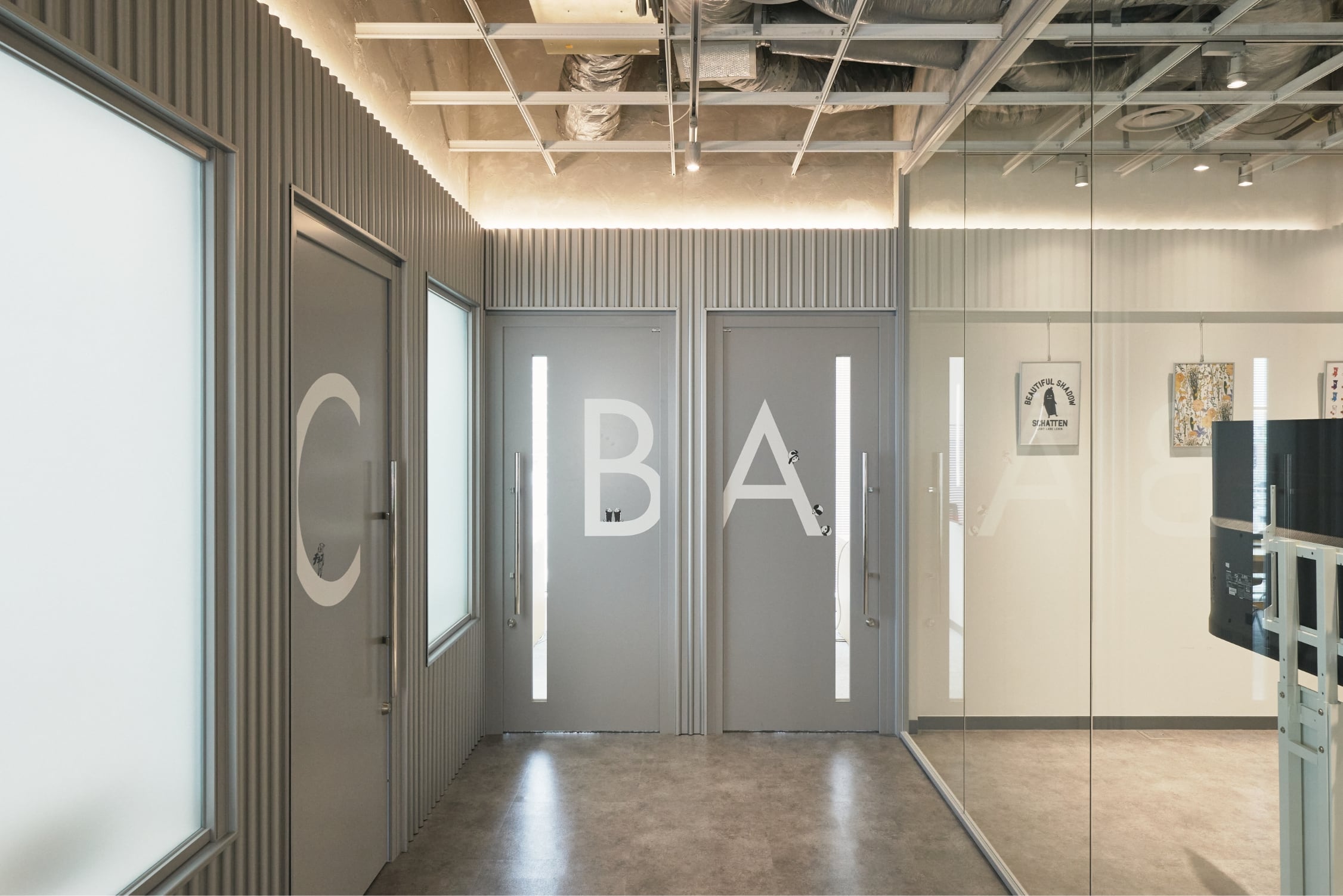
The design of these doors evokes the image of overseas production studios. We installed hallway windows and the entrance displays of the same size to emphasize the continuation.
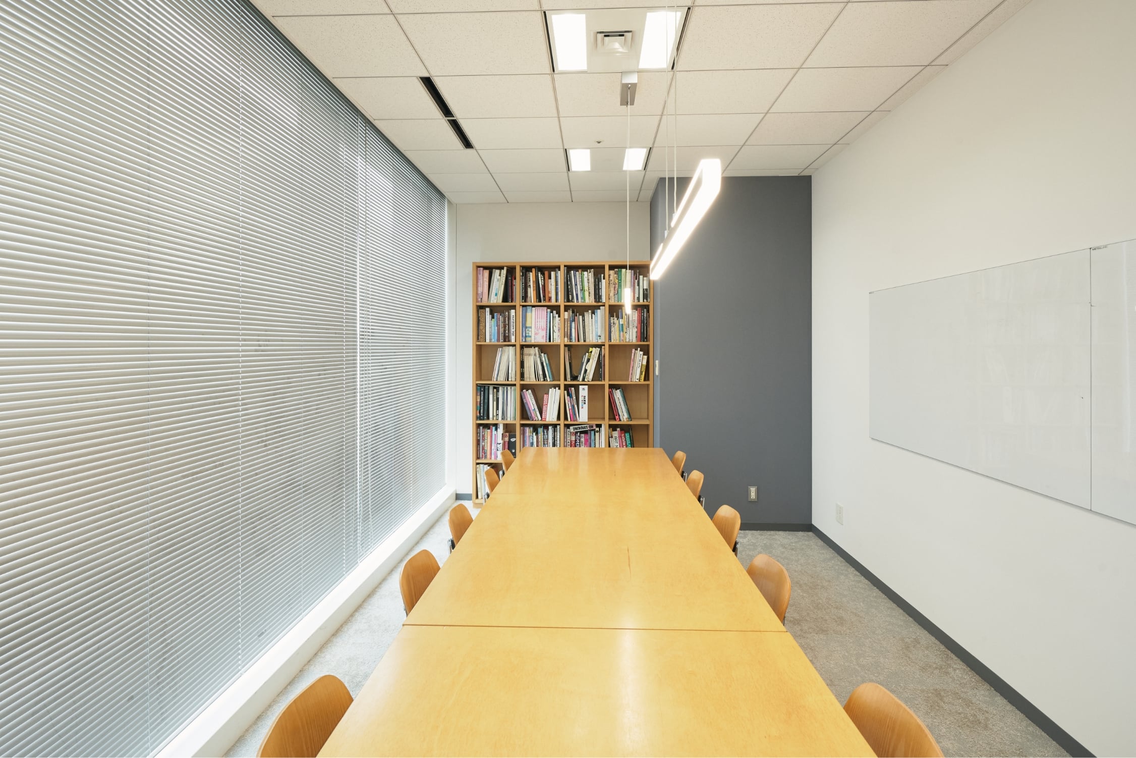
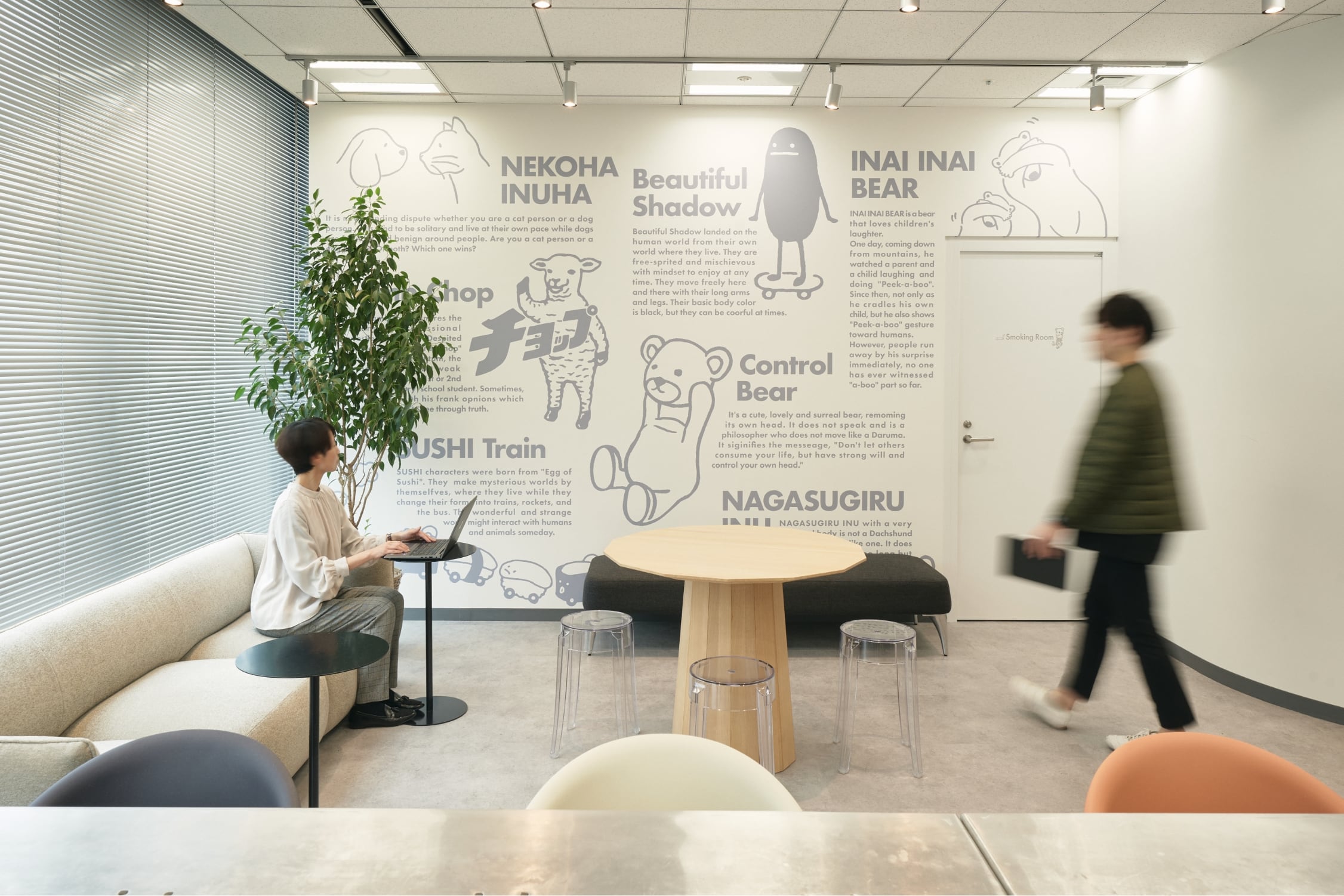
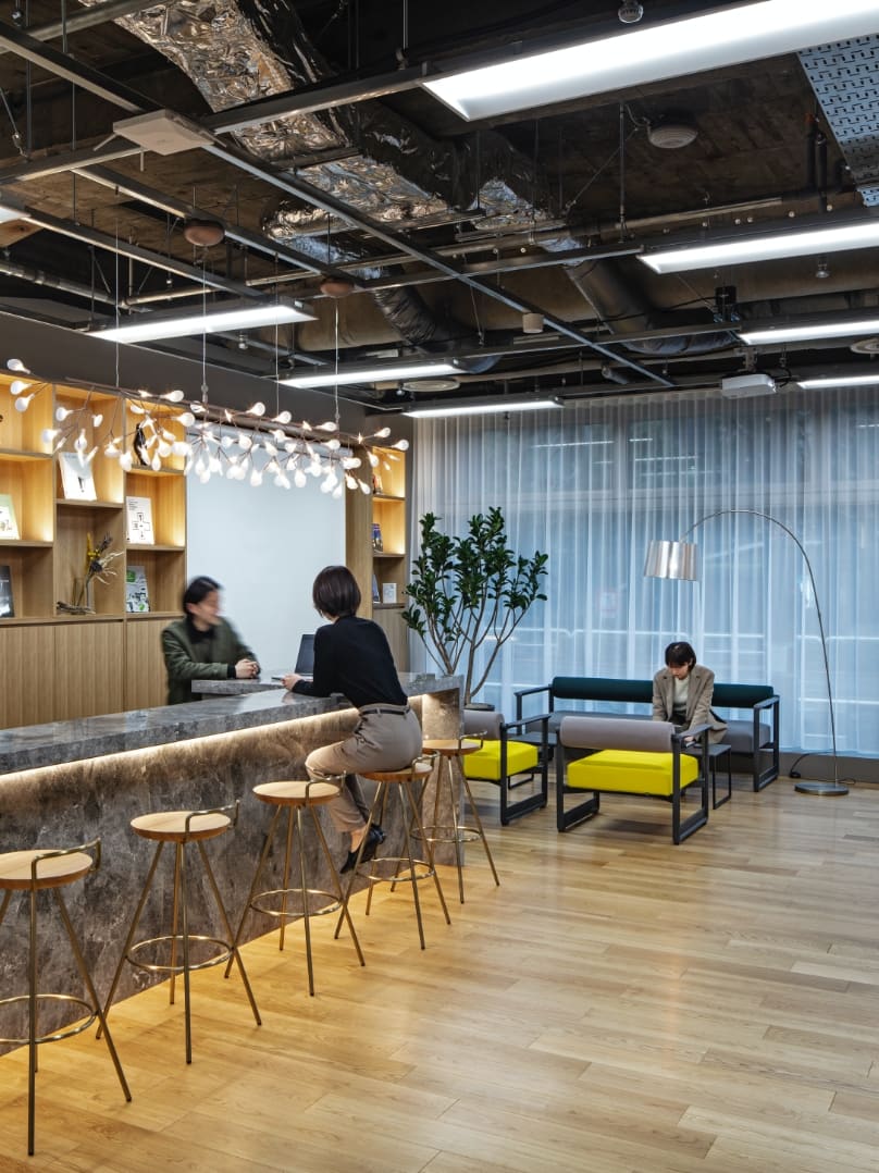
The refreshment space located away from the work area was designed in such a way to create just the right degree of seclusion to enable employees to naturally switch between different settings.
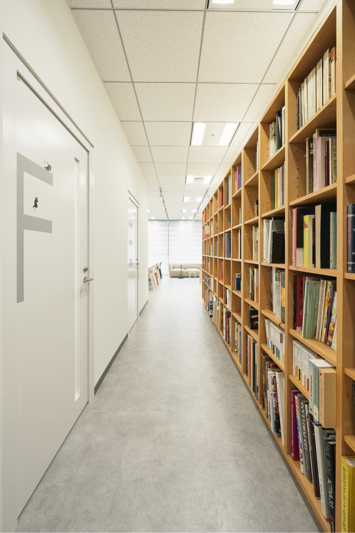
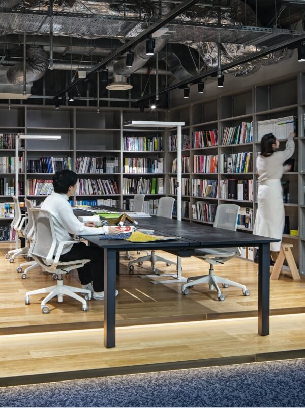
There are small meeting rooms and bookshelves on the way to the refreshment space, so you can work on coming up with new ideas in the refreshment space, book in hand, or work on refining your ideas in one of the small meeting rooms.
LAUNCH
With the rebranding, the client stepped into a new phase. We succeeded in smoothly executing the entire project from proposal to construction by developing a concept consistent with the direction the client was pursuing. We received positive feedback from the client that the new workspace is “easy to use and comfortable.” We believe that we successfully developed a workspace that is sophisticated in its appearance and functionality, but also help increase the motivation of employees.
PROJECT FLOW
-
Clarification of requirements
Through many meetings with the project members, we aligned the design with the direction of the rebranding.
-
Basic plan
For the detailed layout, we took into account the client’s business that offers apparel and other products, and worked out concrete details such as a layout that ensures ease of working, what kind of furniture to be used, and the way things are displayed.
-
Cost adjustment
We succeeded in developing a high-quality design while keeping the cost minimal.
-
Work environment development
We held many discussions with a Type B Construction Work firm about the fittings and finishes of structures as well as the facility’s performance. By proceeding with the project while holding regular meetings and sharing issues and solutions with the client and all stakeholders in the construction work, we smoothly led the development project to success.
PROJECT DATA
Client: graniph inc.
Project: graniph inc. HQ
Business: Work Place Construction
Role: Project Management / Design / Construction
Size: 661㎡
Location: Shibuya, Tokyo
Category: Planning, manufacturing, and sale of products with high-quality designs
CREDIT
- Concept Planning
Frontier Consulting Co., Ltd.
- Project Management
Frontier Consulting Co., Ltd.
- Design
Frontier Consulting Co., Ltd.
- Construction
Sumitomo Realty & Development Co., Ltd.
- Photograph
INFOCUS
BACK TO ALL
CONTACT
If this project got you interested, please do not hesitate to contact us.
Our specialized staff will be glad to answer any of your questions.
WORK PLACE
1704.5㎡
JAPAN FOOD HYGIENE ASSOCIATION
From the past into the future—a workplace that connects history with our time
WORK PLACE
8,510㎡
BANDAI SPIRITS
Creative connections built through a multifunctional workplace with a clear workplace vision
WORK PLACE
3,000㎡
Pigeon Home Products Corporation
Integrating an office, a laboratory, and a factory to set the stage for accumulation of technology and employees’ happiness
WORK PLACE
2540㎡
onestar Co., Ltd.,
Showcasing a sophisticated corporate identity through the pursuit of efficiency and practicality
WORK PLACE
4,990㎡
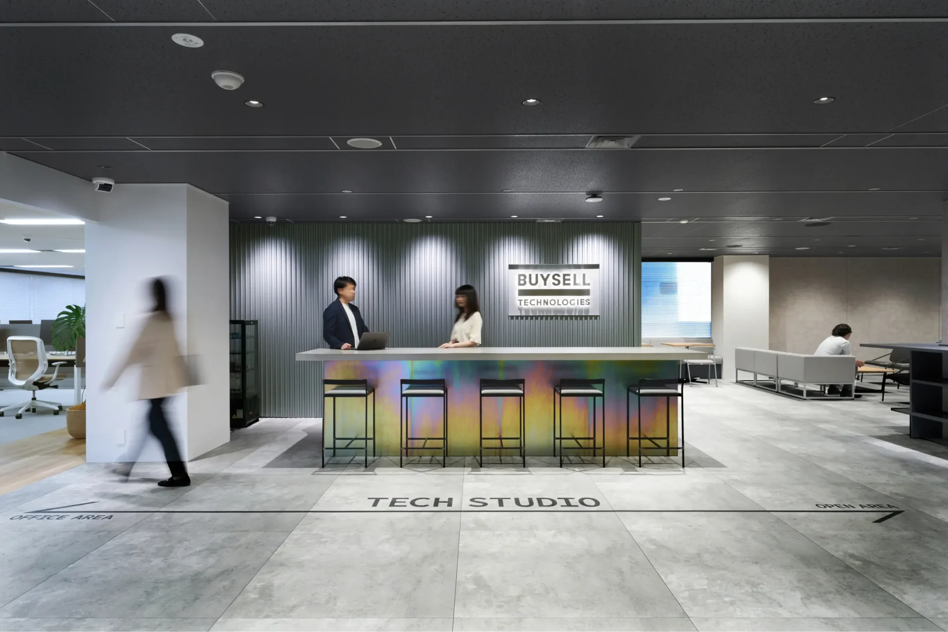
BuySell Technologies Co., Ltd.,
From “Connect” to “Be Connected”—a multi-story office for strengthening connections